WEEK 7 | Ideas
Ideas/Layouts
First thing I tried to experiment with was the shape, as it was our choice. I thought it would be nice to use something that stands out a bit more on its own. I drew up lots of shapes with designs on them to see how the map would work, how the info and illustration would place on it. It was a bit difficult to place things on some of the restricted shapes and I thought they might look out of place anyway. Fast-forward in the design process in illustrator, seeing how all the pieces work I decided to go back to the rectangle board shape as it is simple and lets the design speak for itself instead of focusing on the shape.
In terms of the rectangle shape I was thinking whether to have it horizontal or vertical. Horizontal seems like a much better choice, seeing how its easier to read from left to right than up to down.
I wanted to use the combination of narrow sign stuck to normal curved board (similar to what is used in the Wyre Forest) but I've realized the space is very limited and I could only fit the main info about the route and the map + maybe illustration and then it would be full. And I really wanted some space to implement "games" for children.
I found a picture of a really interesting shape and did a small sketch (1st image down right corner) to see how it would all fit. And even though it looked really interesting, I thought it looked way too modern and it didnt necessarily fit the style I was going for with the board.

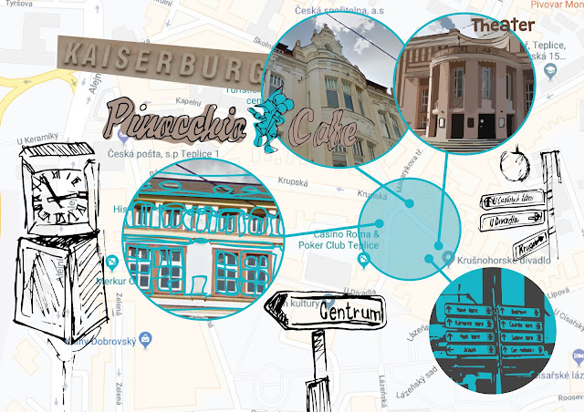
When I realized I was gonna work with the rectangular shape I tried different positions and designs on it seeing what works. Mainly focusing on the map and seeing how is that going to fit in there and how would things wrap around it. Even though I still thought that simple rectangular shape is a bit too boring, I did go for it later on.
I did some font hand rendering to see which one I'd like to go for and seeing from the on-site boards they had quite rounded font which I thought really fits the settings and atmosphere and even though I tried out some fonts that are mainly cursive (Bernadette, 4th from the top) I decided the rounded font would be great to put it all together (Catatan Perjalanan, 3rd from the bottom)


I looked at different layouts to see whats gonna work on each shape. And to see what's gonna work the best.

More polished sketches and colour sketch (more colour development in illustrator later on)


Comments
Post a Comment