WEEK 2 | Session Notes
Information Diagrams
Graphs
- showing range of data
- relationships between patterns in data
- not good for showing small details
- used as a supporting item

-Nigel Holmes, Growth in US Medi-care expenses
=> used graphics that represent what's being portrayed as well as keeping its functionality
Graphs (Charts)
- Napoleon's losses - Russian Campaign 1812
- "possibly the best statistical graph ever drawn"
- Joseph Minard 2 colours 1869

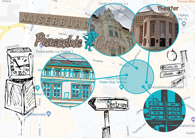
Maps
- best for showing geography
- not good for when other info besides location is important
- commonly used at the start of articles

Diagrams (IKEA instructions)
- basic b&w line
- simple layout using columns and grids
- use of magnification boxes to show detail
- arrows to show motion of turning
- main audience is adults

Glance Boxes
- show key details
- show trends in data
- commonly at the start of books/articles

Sequences
- showing process over time
- not good for showing trends where the end result isn't key
- used as supportive visual element


Comments
Post a Comment